Ho Farms is located in Kahuku, Hawai’i on the island of O’ahu and ran by the Ho family. Their produce is made available at local farmers markets and select grocery stores. Their passion for farming, innovative spirit, and deep commitment to bring the best possible food to the community’s table has made them a much loved farm on O’ahu.
For this school project we were asked to redesign a current website for brand consistency. New design should relay company values and practices and provide clear information to consumers looking to gain product knowledge and company awareness. Use any existing content available. However, imagery and graphics may be created or substituted if they do not meet design expectations.
02 — Features & Functions
Info-graphic hover & click
Social media links
Contact form
User friendly navigation
Interactive google map
Responsive design
Product detail page & recipe suggestions
Information features are
New & Updated
Chapter 02
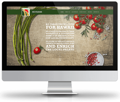
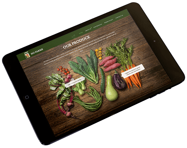
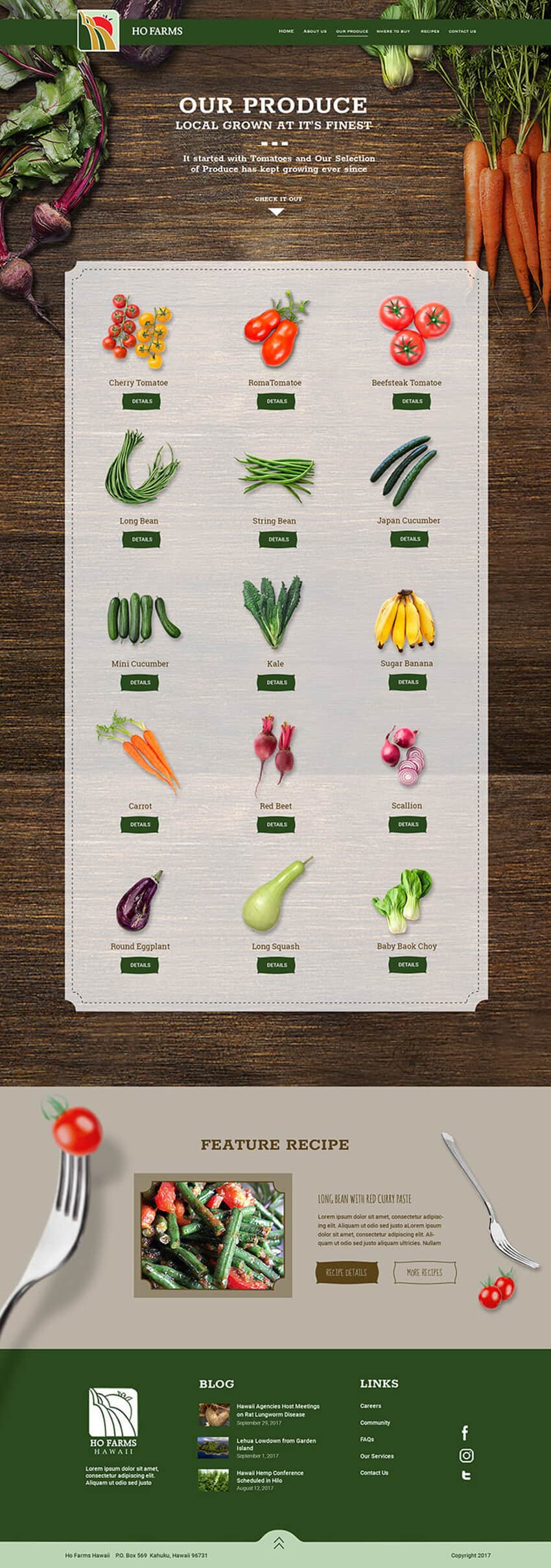
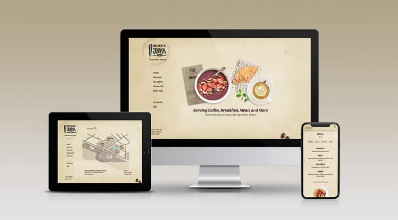
Your Veggies Just Got Interesting
To make this company more noticeable over local competitors came the idea to present produce in a more interesting and engaging way.Rich colors and organic earthy tones and textures reinforces the brand’s mission to always provide healthy fresh local produce to their customers. Using scale transitions, hover effects and info-graphics takes the blah out of vegetables and brings the excitement back into consumers minds.
Vegetables are Wholesome & Fun!
scroll through
Chapter 03
A Glimpse At The Process
Conceptual Phase
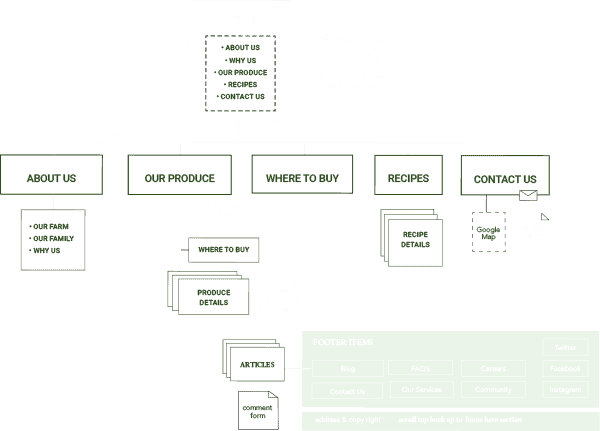
01 — Creating a site map
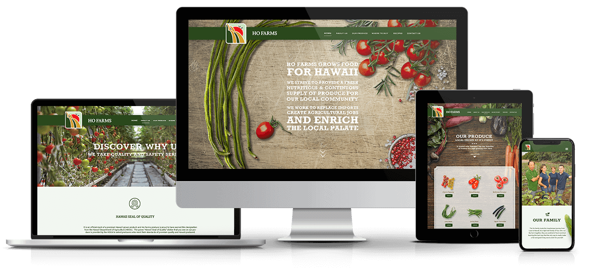
In review of the company’s content on their current site, I opted to showcase only five top level pages and keep the focus on their products and brand.
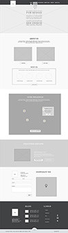
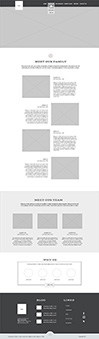
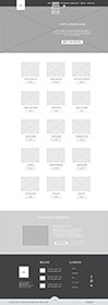
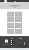
02 — Developing wireframes
Figuring out the interface structure to this multi-page site was an important part of the process before any visual design or coding was done. Laying out the blueprint first, helped me to design within these parameters.
Although the font library for this site is larger than the standard, all fonts worked well with each other. Rokkit was chosen because it closely resembled the fonts used in Ho Farms main mission statement. Lusitana was used for it’s subtle elegant curves. It is a nice contrast from the thick hard lines of Rokkit and the thinness of Roboto and serves as a nice transition to both fonts. Roboto was chosen for the friendly open curves along with it’s readability across all screen devices. Lastly, Roboto Slab for it’s similar lines to Rokkit. It is less intense than Rokkit making it a perfect substitute for less pronounced headlines.
04 — Selecting colors
Consumers relate to the colors of greens and browns when thinking about wholesome fresh produce. I looked at Ho Farm’s existing logo and began to pull together a color palette from there.